Adding Color to SOLIDWORKS Visualize Projects
Color is a crucial element in visual media as it influences how viewers perceive the final product. Understanding the components of color and how you can control these within SOLIDWORKS Visualize will improve your renders. While color theory can be a deep topic, we will stick with the basics and how they can be applied to Visualize projects.
Defining Colors in SOLIDWORKS Visualize
In SOLIDWORKS Visualize, you can select appearance colors through the color picker, which appears when clicking the color section of an appearance.
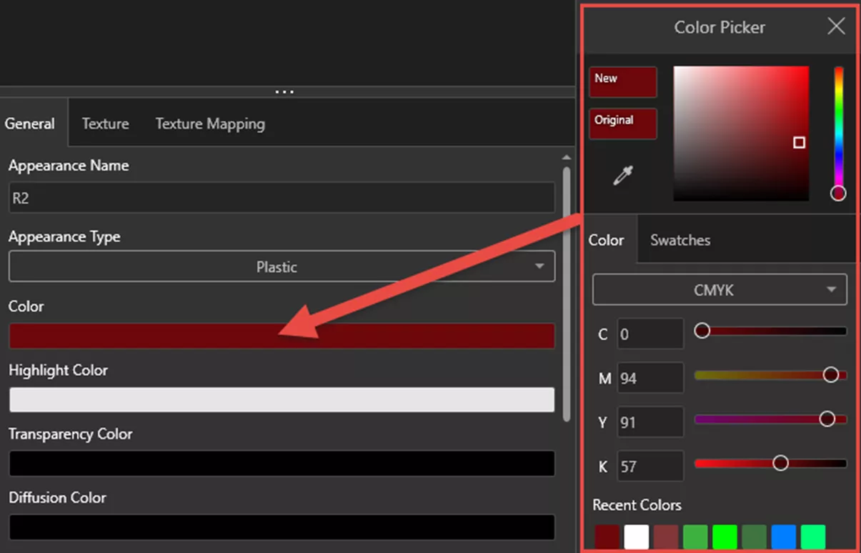
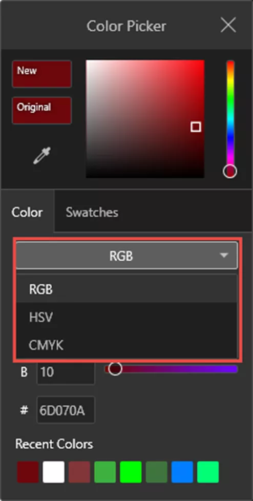
While you can use the slider in the upper half of the color picker, you can also change between three different modes of color entry:
- RGB – Red Green Blue
- HSV – Hue Saturation Value
- CMYK – Cyan Magenta Yellow Key (Black)
Additionally, the color picker has pre-built Swatches as well as the ability to define a color palette.
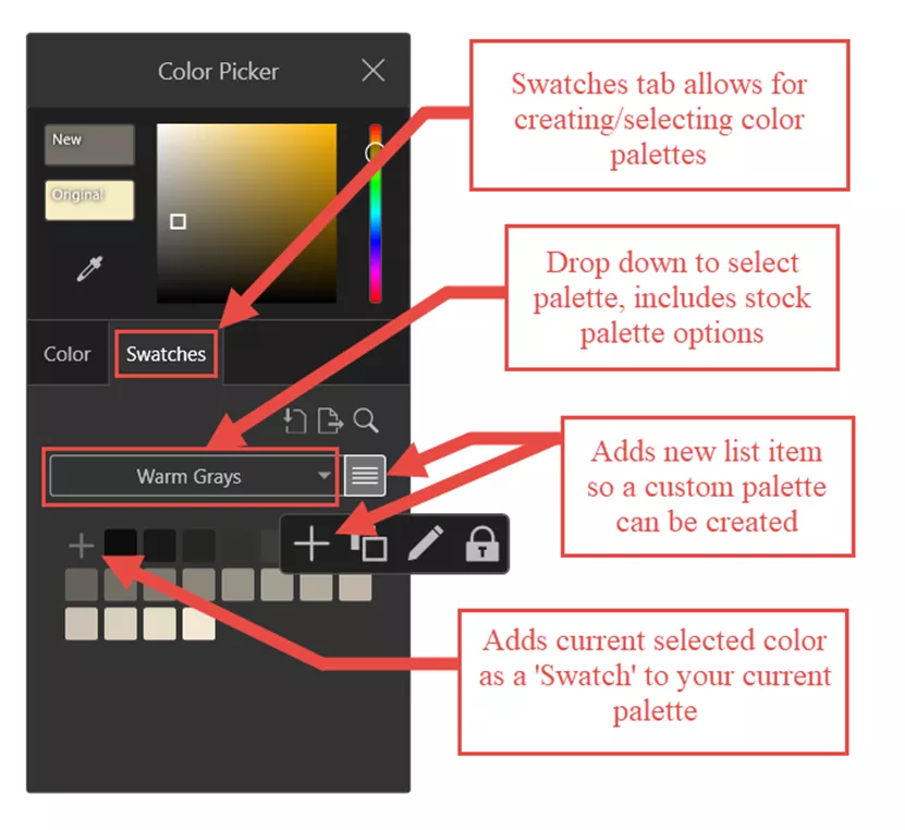
The Swatches tab lets you pick from stock palettes such as Pastel Colors or Warm Grays - or create your own color palettes. Creating color palettes in advance can help ensure consistency between projects that share the same colors.
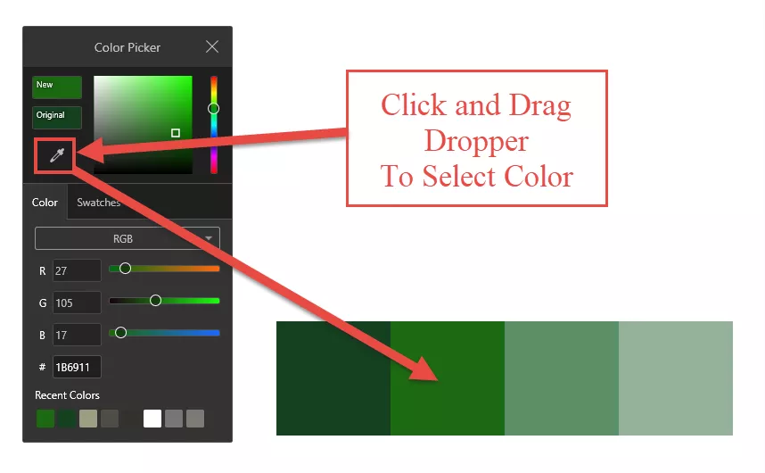
Lastly, use the eye dropper in the color picker to select colors on your screen without inputting values or using the sliders. This is useful if you have a reference image or color palette that you would like to grab the colors of.
Saturation and Value
It is important to understand how the saturation and value of a color can affect the result. Selecting a color palette is more than just the hues.
Pure hues with full saturation at bright values (shades) will tend to give off a vibrant and fantastical tone.
In some cases, it may be best to avoid over-using high saturation because it can come across as unrealistic. Real life often leans towards lower saturation, while nature can appear quite saturated.
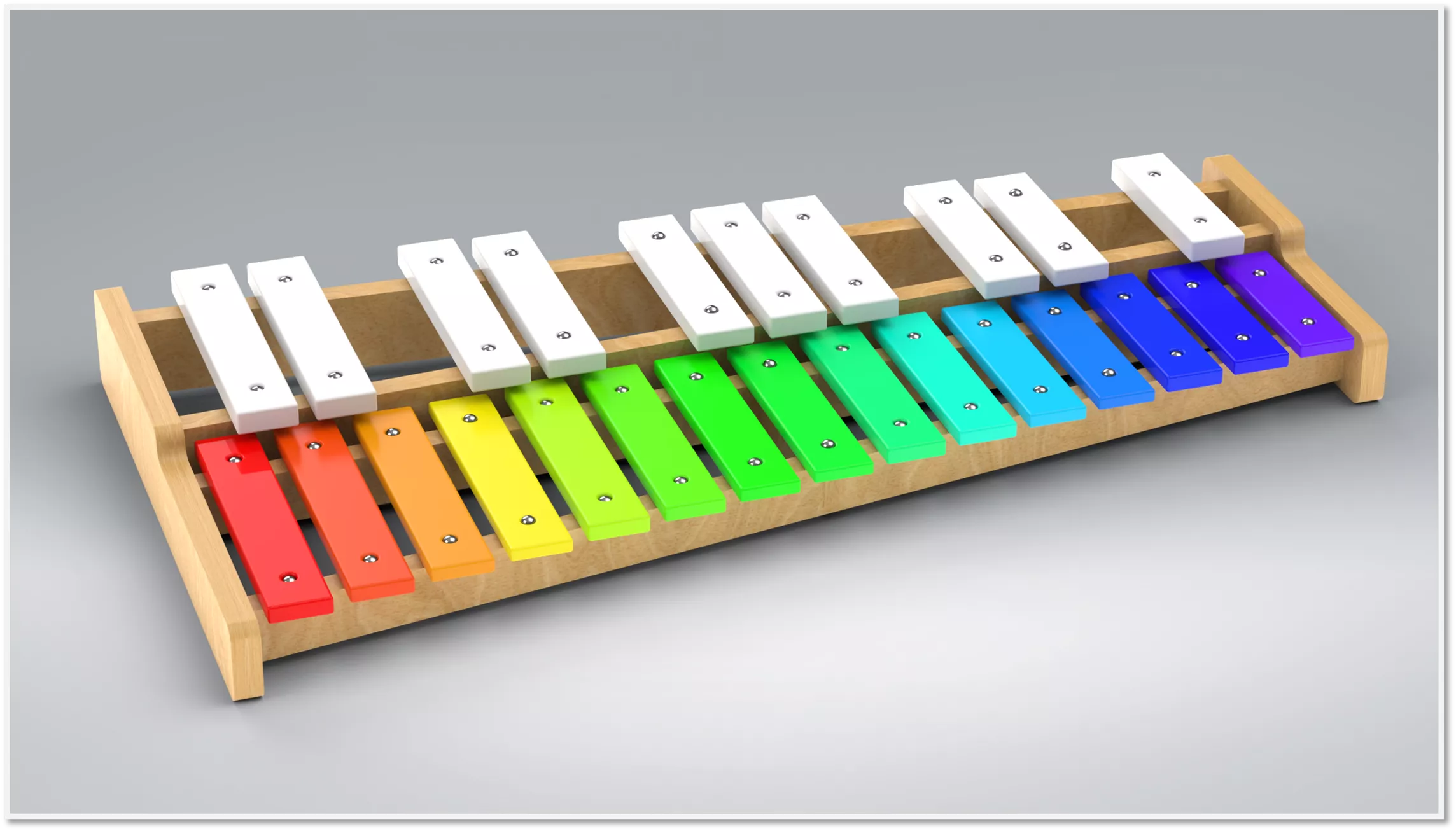
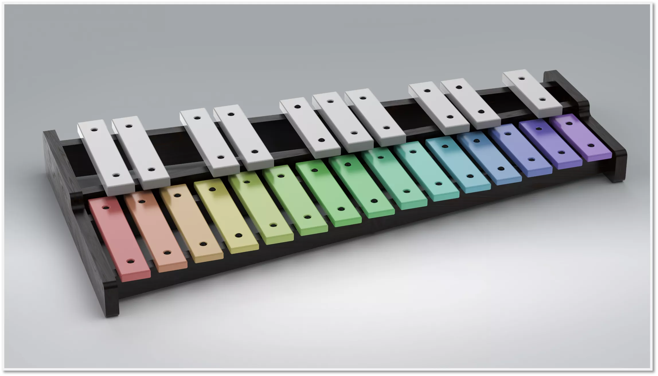
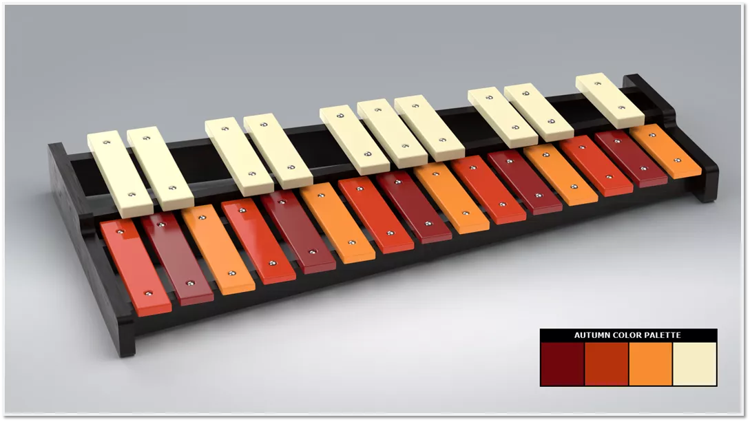
Using the same colors at a lower saturation and darker value can result in a more professional tone or realistic look. For instance, if marketing a xylophone for children, a saturated and vibrant version makes the most sense. If marketing towards adults, using more desaturated colors and darker values may be more appropriate.
Now with Saturation and Value in mind, it is time to look at how you might select the Hues you want for a color palette. A good place to start is using a color wheel and how it can be used to identify color schemes.
The RGB Color Wheel
A color wheel is useful for visualizing colors and their relationship to each other. Color wheels are defined by their primary colors, for example, RGB (Red Green Blue) or RYB (Red Yellow Blue). In this case, we’ll look at the RGB color wheel since this is most appropriate for digital art.
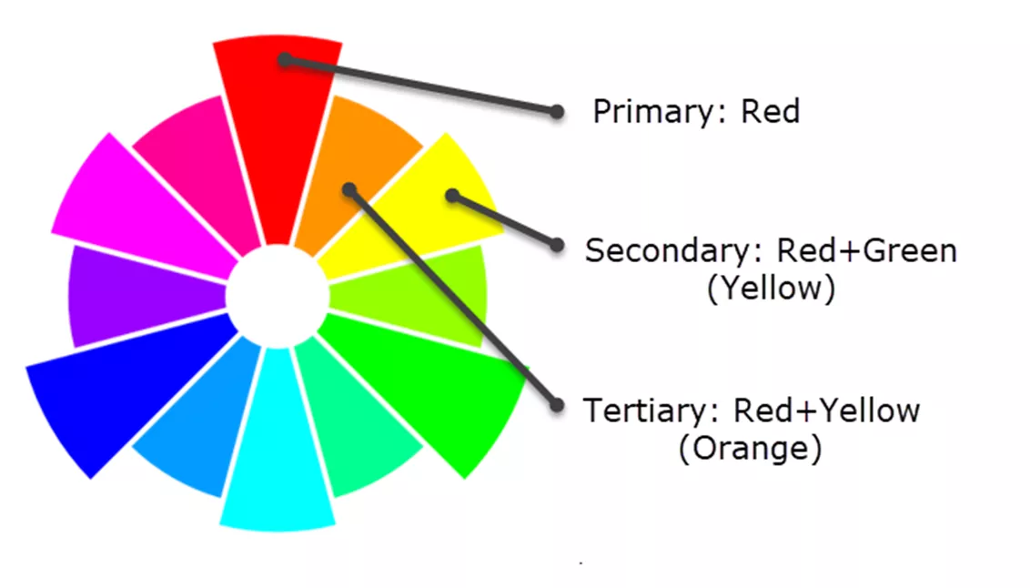
The RGB color wheel can be broken down into Primary, Secondary, and Tertiary colors, where Secondary is a result of mixing primary colors, and Tertiary is a result of mixing secondary with primary colors.
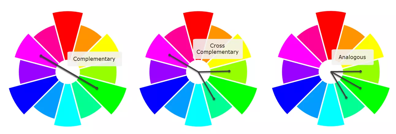
Color theory has many color schemes established from the respective color wheels. Some examples are:
- Complementary Colors: These are colors that are directly opposite on the wheel. On the RGB color wheel, for example, Blue and Yellow would be complementary colors. Using complementary colors is useful for establishing strong contrast.
- Cross Complementary Colors: This is similar to Complementary, however not quite as bold a contrast. This uses colors adjacent to the complementary color.
- Analogous Colors: This uses a series of adjacent colors. Analogous color schemes are flexible and depending on shade and saturation can create a variety of tones. Analogous color schemes can be found easily within nature.
A simple method to establish a pleasing color palette is to reuse what is found in nature. One example of an Analogous color scheme would be the colors seen during the fall. Using the dropper tool in the color picker from earlier in this article, you can create a color palette from an Autumn photo, creating a fall-themed color palette.
While this information is only some of the basics of Color Theory, it will help establish a foundation for intentional color selection when working on SOLIDWORKS Visualize Projects. There are many online sources to consult when it comes to color theory or even pre-established color palettes that can be used.
I encourage you to take this knowledge and try out new color schemes and experiment with the saturation and values of your colors. Sometimes all it takes is a bit of trial and error to make something that looks good into something that looks great!
That concludes adding color to SOLIDWORKS Visualize projects. Be sure to check out our other Visualize articles below and the new features available in SOLIDWORKS Visualize 2024!
Visualize Training
Want to take your SOLIDWORKS Visualize skills to the next level? Our SOLIDWORKS Visualize training course covers how to leverage 3D CAD data to create photo-quality content in the fastest and easiest way possible, from images to animations, interactive web content, and immersive virtual reality.

Related Articles
SOLIDWORKS Visualize: Applying Textures & Texture Mapping
How the SOLIDWORKS Visualize Denoiser Tool Works
About Braden Leasure
Braden Leasure is a Sr. SOLIDWORKS Technical Support Engineer at GoEngineer.
Get our wide array of technical resources delivered right to your inbox.
Unsubscribe at any time.